Showing posts with label Paint. Show all posts

Wednesday, November 9, 2011

A "matchy-matchy" look I actually go for

I'm working with an e-client on the freshening-up of her living and dining rooms.  She's having crown moulding and built-ins added, and my suggestion is to paint the wall and trim the same color, but with different finishes à la this room by Suzanne Kasler.


...and then, paint the insets of the built-ins with a contrasting color that coordinates with our design scheme...
source unknown
  
Nothing radical, but a nice twist, and a step away from traditional.  Remember how Martha toned down the heavy (albeit impressive) moulding in one of her myriad homes with this pretty shade of blush? Splendid.


By keeping all this trim monochromatic, the room stays out of Fussydom

Serene.
Historic Victorian Bedroom contemporary bedroom
It works well with more streamlined trim, too.
Private Family Ranch Retreat eclectic hall
*Last three Images courtesy of this post on Houzz

Definitely. Yes.

Friday, October 28, 2011

Hacked by Hague

Well, it only took me about a month, but I can finally say I'm finito with the hack of my old, Ikea media cabinet.  Thanks to the generosity of Kathy from My Interior Life, who sent me a color-match of Hague Blue,  I was able to have my own Brazilian version made.  The paint mixer here was so "impressed" with my obsession dedication to having it just right that he renamed my custom color "Azul Americana." I'll take that as a compliment. ;)

DSC_2885

I also subbed in the same gorgeous, brass pulls we used on my sister's hack.  They play very well with Hague.
DSC_2887

The space above the odd-height cabinet will be earning some new artwork from Miss Jenny. 

Loving that reflective finish SO. MUCH.

...and since we're starting Halloween weekend, I'll go ahead and show you the Before again - it's kinda SKEEEERY!
DSC_2452

Have a Spooktacular weekend, Peeps!

Wednesday, September 28, 2011

The Little Paint Swatch That Could*

Recall that I've decided to paint our ugly, old Ikea media cabinet, and I want to go Hague Blue. I tend to become very one-track-minded when it comes to these sorts of things. NOT a great disposition to have when you live overseas, and the product you desire is only available in The USA and Canada.
I think by the time it's all said and done, this project might qualify as an Act of God, because that's practically what measures are going into finding the closest match to "Hague." You see, this deep blue has many faces....

In a flat or satin finish, she appears fairly straightforward - marine-like blue with maybe a hint of gray.

Source: google.com via Alison on Pinterest


...but, gloss her up, and she takes on mutations of teal.

Source: google.com via Alison on Pinterest


Nimble little minx, isn't she?

I won't go into the finer details of the attempts I've already made to find a close match, but let's just say they do things a wee bit differently in the paint world of Brazil, and it hasn't been successful.
So, I did what all desperate bloggers do - made a plea to Stateside blogstress amigas, Kathy and Jenny - who both have first-hand knowledge of The Hague.
According to Jenny, Benjamin Moore makes two dead-ringers for The Hague:
Hague Blue mission
So, armed with swatches of all three, as well as another from a Sherwin Williams colormatch, I will march down to my local paint store, and demand my right to some Haaaggguuueeee!

Oh, and I'm pretty sure an 'interpretation' of this painting needs to go above aforementioned media cabinet.

Source: jaclynpaige.tumblr.com via Alison on Pinterest

Bottom Line: If I can design to my tastes in Brazil, I can design ANYWHERE!

*Post title coined by
Kathy

Monday, April 25, 2011

Happified

Something got a little facelift this weekend....
DSC_1770

Spray paint,*cue Elmo voice* "You my only fren...."

Thursday, January 27, 2011

What would I do?

Do B&A pics draw you in, almost addictively? I'd venture to say my interest has some sort of sadomasochistic twist, since I have precious little opportunity to partake in Before and After fun - what with the lack of resale/Habitat/Craigs down here in Brazil. (Do I hear violins?)

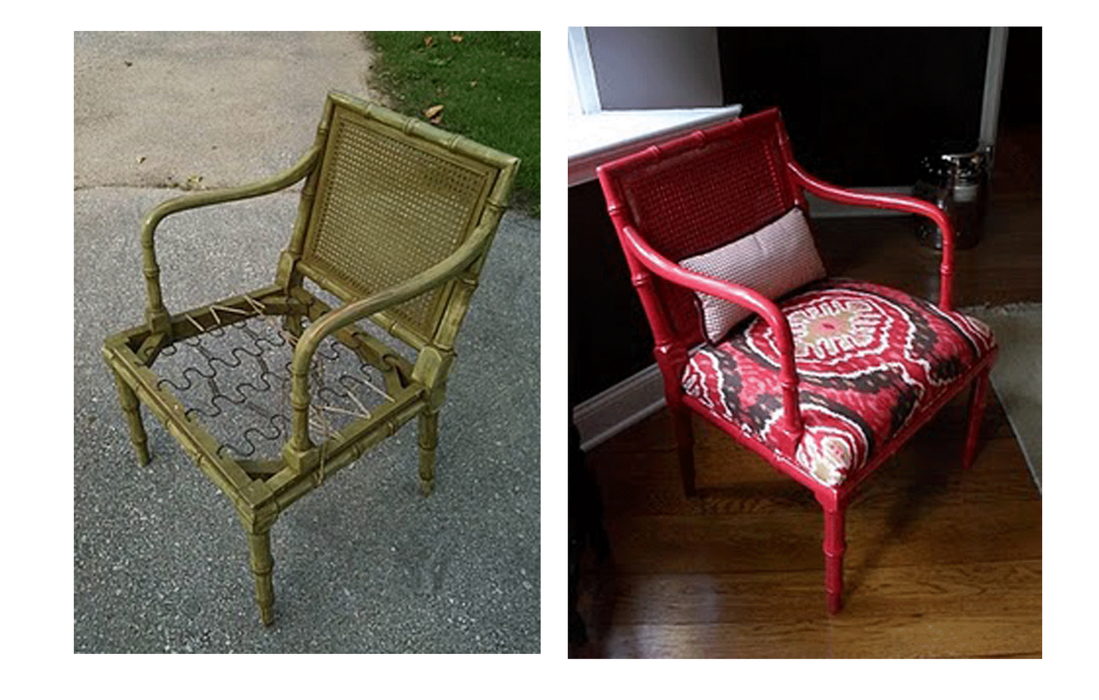
Anyway, I still spend hours conjuring up the What Would I Do's when I see something begging for a facelift. Lately, I've seen some very snazzy images of cane back chairs taken from sads to shaZAMZ


So, when I spied this little 'ol lady (one of a pair) on Houston Craigs, I immediately thought of giving them a new lease on life for my sister client.
Of course, fabric and color selection depend on room, personal aesthetics, and for me, mood. Here's a few fabric and paint combos I put together:
Colorful Classic lineup_edited-1 copy
Yellow Ikat via L&S + Glidden Rich Navy

Subtle-Elegance-lineup
Flowering Branch via CC + Francesca by Martha Stewart Paints

Sophisticated-Darling-lineu
Sudan by L&S + Behr Premium Ash Violet

Tailored-Trendy-lineup
Formosia via L&S + Glidden Deepest Wooden Green

Posh lineup_edited-1
Jamil via L&S + Glidden True Turquoise

What would YOU do?
*Psst...if you don't know, let me help you! email me at: atexski@yahoo(dot)com

Sunday, January 23, 2011

Would you ever?

...have the patience to do this...
In order to get this?
...and finally, this?
LeAnn did. She lives in Austin, so, she's de facto cool. And talented. Really, ruuullly talented. ...and patient, apparently.

Monday, November 1, 2010

Project Planning: Sister's Casa

My sister, Brooke, and brother-in-law just bought a "next step" home. It is spacious, and has a lot of potential, and I can't wait to get my grubby little hands on it! So, I guess it's a good thing she's already been hitting me up to put together some inspirations and ideas. I wonder if there's such a thing as putting a decorator on retainer? Hmmmm....

Anyway, because the house is quite a bit larger than their starter home, they'll need a good amount of furniture - not to mention the layering it'll take to make it feel really special. Almost the entire house will get a new coat of paint - right now, it's a mish-mash of colors they'd never select. Obviously, some rooms, like the family room and master bed/bath, will take priority.

The dining room probably isn't one of them, but I keep coming back to it for some reason...
markandbrooke dining before

Since it is one of two rooms seen immediately upon entering the house, I pause at the idea of leaving it blank for too long. I also pause over the fact that someone recently sponge-painted ANYTHING, but I can see why the previous owner might have tried to give the room some sort of architectural interest. It is screaming for it, is it not?

I immediately thought of panels, and likely using them to frame out some wallpaper or fabric. I recently spied this particularly brilliant idea - bamboo yoga mats framed out to give the incredible texture of grasscloth, without the investment. It's waaay more interesting, too!


Brooke isn't looking for a tightly traditional aesthetic, and so far her color palette is neutral. Something soft like this might work, if she wants to keep it calm.


I'd be more inclined to go the way of something like this. It maintains a "safe," traditional element, without going geriatric.
We're heading to The States for Christmas, and I'll have about three weeks to pull together at least a room or two, so let the project planning begin! BTW - it's Brooke's birthday, today - so this post goes out with big hugs, kisses and Birthday wishes!

Wednesday, August 4, 2010

Details Geek Needs Help!

Two things going on at Casa Giese: Isla's nursery and the "office/playroom"

First: I had a burst of get-it-done energy last weekend, and tackled Avery's old changing table with a new coat of paint. It's a small, vintage sideboard we picked up in Virginia for $25 before Avery was born. It serves perfectly as a changing table. I was ready to see the shabby look go, though, so it got a coat of gray paint.

Before: Sanded-down white with glass knob hardware

DSC_1813

Partial After: Light-ish gray
DSC_0087

I intend to change the hardware, but have hit a stumbling block - and this is where I need your help....

If I go with ring pulls, similar to these on the drawer:
What do I use for the cabinet doors, where the the same ring pulls won't fit?
Egg knobs in the same finish?

Round knobs?
What about a sleeker, cleaner, but also shinier situation? (Dare I go polished brass???)
Align CenterNeed your thoughts!

Also, I was thinking of keeping the "canvas" of the room very neutral in all grays - gray walls, gray changing table, and a gray and cream ikat on the glider (waiting to be reupholstered) and then letting colorful art take center stage, but it that TOO much gray?
DSC_0088
Should I repaint the changing table black, or at least a very deep, charcoal gray, to add some more contrast? (Think that polished brass hardware = yum!) Yes, I'm noting the difference in hues between the fabric and paint...yet another dilemma...

I think in my haste, I'm not really thinking the design through, and need some guidance - so dear gurus of style.... Lead me!

*I'll let you chew on this for a day or so, then I'll follow up on the office/playroom situation soon!

Thursday, January 14, 2010

Do Hormones make you Indecisive?

You all have been so eager to hear my plans for Baby Girl #2's nursery, I feel like admitting my lack of a coherent design will be a great disappointment...
Truth be told, my brain has been inundated with the logistical high-wire act that is involved in a Government Overseas MedEvac (what they call my transfer to the U.S. to have this kiddo).
I'm also wavering on my choice of OB/GYN for delivery. Avery was delivered by a Certified Nurse Midwife (in a hospital in NC), and it was perfect. I'm not convinced the MD I selected in Texas is willing to participate in recreating a similar birth scenario, so I'm currently weighing all my options to achieve that goal...
Oh, and Ben and I can't agree on a name for Giese Girl - what I love, he hates, what he wants, I'm lukewarm on (ugh!)

Needless to say, The Nursery has not been as much at the forefront of my thoughts as it might normally be. However, I head back to The States in less than two months, so I need to make some decisions - That's where I hope you'll come in!

For those of you who haven't seen it - this was Avery's nursery.
It was soft and sweet - but not syrupy so.

My tastes have changed, and I initially thought I would sell all the pink bedding, etc and go for something a bit more bold. However, the reality is: the bedding is in perfect condition, it's Italian-made - so wasn't cheap, and practicality (and time) dictate I keep it. Bummer, I know.
I haven't had the opportunity to get my gray on, so thought this might be a good way to do it.
I'll paint the nursery walls a pearly-gray - something along the lines of that middle swatch.

And where I'll save in NOT buying a new crib set, I can spend towards reupholstering this (admittedly hideous) glider, and hopefully a set of curtains.
This is where I hope to get my pattern fix - but which way should I go???

Stick with an overall soothing palette - maybe an ikat or chinoiserie toile - using more texture than color to achieve interest?

...Or, go all out - letting bold color be a foil to the soft pink bedding - maybe the stripe on the chair, the big floral for curtain panels???
Rest assured, I'll figure out some way to make the room less BORING (at least I hope so!) but in the meantime, I need some color guidance ASAP! Can ya help a Mommy out??