Two things going on at Casa Giese: Isla's nursery and the "office/playroom"
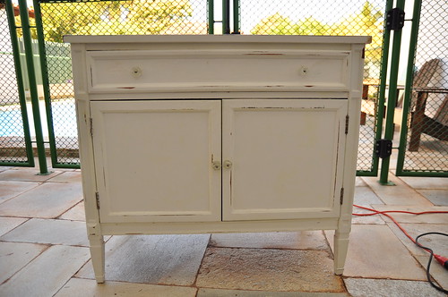
First: I had a burst of get-it-done energy last weekend, and tackled Avery's old changing table with a new coat of paint. It's a small, vintage sideboard we picked up in Virginia for $25 before Avery was born. It serves perfectly as a changing table. I was ready to see the shabby look go, though, so it got a coat of gray paint.
Before: Sanded-down white with glass knob hardware
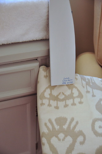
Partial After: Light-ish gray
I intend to change the hardware, but have hit a stumbling block - and this is where I need your help....
If I go with ring pulls, similar to these on the drawer:
 What do I use for the cabinet doors, where the the same ring pulls won't fit?
 Egg knobs in the same finish?
 Round knobs?
Also, I was thinking of keeping the "canvas" of the room very neutral in all grays - gray walls, gray changing table, and a gray and cream ikat on the glider (waiting to be reupholstered) and then letting colorful art take center stage, but it that TOO much gray?
Should I repaint the changing table black, or at least a very deep, charcoal gray, to add some more contrast? (Think that polished brass hardware = yum!) Yes, I'm noting the difference in hues between the fabric and paint...yet another dilemma...
I think in my haste, I'm not really thinking the design through, and need some guidance - so dear gurus of style.... Lead me!
*I'll let you chew on this for a day or so, then I'll follow up on the office/playroom situation soon!
I think in my haste, I'm not really thinking the design through, and need some guidance - so dear gurus of style.... Lead me!
*I'll let you chew on this for a day or so, then I'll follow up on the office/playroom situation soon!


14 comments:
I would go with the polished brass ring pulls. Only I would tarnish them a bit to make them match the drawer knob. Love your blog!
I love the first pull you posted, can't wait to see what you decide on! I also like the color you have the dresser painted, I say live with it for now!
I think the top two knobs would look great together. I love the subtle grey as well as the ikat print.
I think you should leave the changing table the color you have it...softer like a baby. Any of the hardware you choose to mix and match will be great as well.
What about putting brass pulls on the top that look similar to these:
http://www.restorationhardware.com/rh/catalog/product/product.jsp?productId=prod1278235&navAction=jump&navCount=2
Whatever you do will so good.
I think I would go grayer with the changing table to add some depth to the room. Given that you're using all one "tone" of color in the walls, furniture and fabric, I think the look can read a little flat (soothing, but still flat in my opinion). I think I would pair the knob pulls (which I loooove) with something still in the brass family but slightly more dainty like these from Anthro. I think the mother-of-pearl will look incredible on a charcoal or even black piece.
Hope that helps! I'm in the midst of nursery design/installation myself so I feel you on the design details that we agonize over that no one will ever know about!
I would not change the color of the table. I like the soothing almost monochromatic look. The fabric gives it visual and textural interest. As you said, you can bump up the color with art and accessories. Go for the brass ring!
I just ordered those polished brass ring pulls to dress up the Ikea dresser that we'll be using as a changing table in our nursery! We were thinking of using grays, too... but we're having the hardest time settling on one. I've been looking for something that has a khaki/gray tinge, but it's hard. I definitely think that adding in some black wouldn't hurt. "They" say it anchors a room.
It's not too much grey! Artwork and colorful throws and pillows will look fab!
I like the ring pulls.
polished brass!!!
also go here:
http://www.muffshardware.com/
lovely little things there.
I like the polished brass. where did you get that glider? I like. I'm on the hunt for one.
I love that polished brass...so yummy! And all the gray makes me happy! Keep it all going...can't wait to see the finished product
I loove fixing up furniture finds. I would go with one of the similar tarnished looking ones. My favorite being the second knob you posted.
Good luck!
I like the polished ring pulls, but not if they end up overlapping one another. I like the color you have. I think black would be harsh...and the lovely dove grey you have is soothing :) Use accent pieces and knick knacks to give you the color pop or contrast you are looking for...maybe a bright lamp. Good luck!
hmm, I really like it the way it is. But maybe a dark gray would make it pop and give the room a bit of a change from all the light colors. Oh and yes to the polished brass, hot look!
Post a Comment