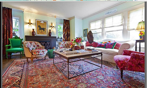
I came across this (not necessarily new) spread. A home decorated by Dallas designer, Michelle Nussbaumer. The style is described as "Rich Hippie." And it was a "temporary" home for the clients. Uh huh. Take a gander, then, let's talk...
What's your first impression?
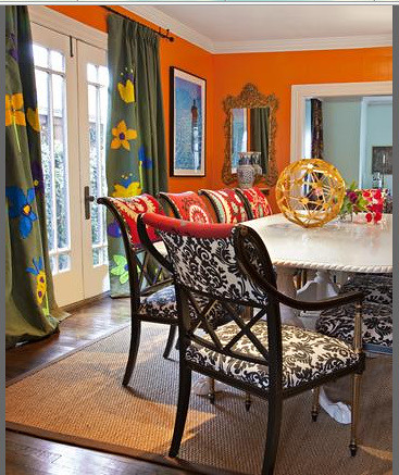
Or does your little devious inner voice gasp at the sheer excess of it all? For instance, take those curtains in the (tangerine??) dining room - the felt flowers were hand-drawn and sewn by Nussbaumer her assistants. This is a designer known for her vast knowledge of antiques, and she goes for a DIY felt project? If I were the client, I'd be more than a little ticked at the "quirky" use of my funds...
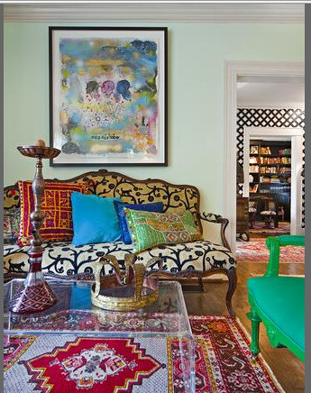
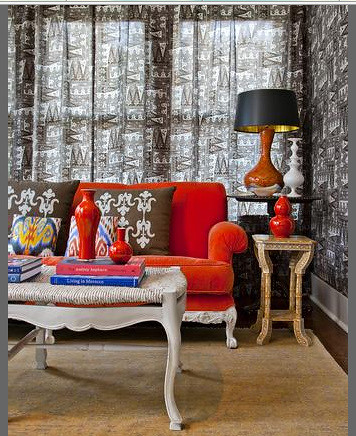
Here, in the Batik-laden sunroom, she used a clementine velvet sofa (which I kinda lerve), but paired it with a French Country coffee table that probably has serious provenance, but that I swear you could recreate via Hobby Lobby. Oh, and get this...she stated that the bench/coffee table was washed with a cream white, because "bright white paint looks cheap" (or something along those lines) Really? Go back and check out that dining room table....
Here, in the Batik-laden sunroom, she used a clementine velvet sofa (which I kinda lerve), but paired it with a French Country coffee table that probably has serious provenance, but that I swear you could recreate via Hobby Lobby. Oh, and get this...she stated that the bench/coffee table was washed with a cream white, because "bright white paint looks cheap" (or something along those lines) Really? Go back and check out that dining room table....
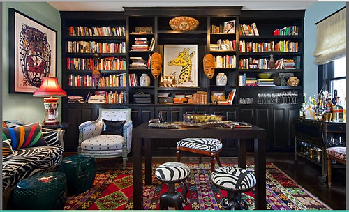
Office/Library of a World Traveler = Good
But, are you seeing my point, here? Yes, designers have an obligation to create a space that adheres to clients' wishes, and perhaps this client wanted the "I have so much money, I can have a 'temporary,' eccentric home" look. But, I would argue that designers also need to push past their own whims. To me, this space is wasteful.
It reminds me of some line in Ben Hurr or other epic film where there's a Ruler who does nasty things because [insert snooty accent] "It amuses me."
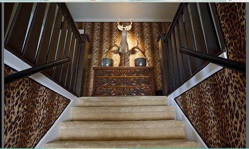
If this stairwell were sans the blah-beige carpet, I might, might be able to give it a pass...but something about these carpetted stairs makes it beyond repair.
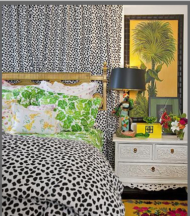
Bedroom madness
So, tell me, am I getting bogged down? Do I need to take a deep breath, and remember that design is a world where style is ultimately subjective, and where there really is no accountability on the part of the designer, so long as the client agrees and signs the invoices?
Set me straight, peeps!
On a lighter note...If you're a mommy-to-be or new mommy, check out my guest post today at Odi et Amo featuring my Advice for New Moms.
Set me straight, peeps!
On a lighter note...If you're a mommy-to-be or new mommy, check out my guest post today at Odi et Amo featuring my Advice for New Moms.



17 comments:
YIKES! Where to begin?? Sensory overload for sure. The window treatments are hideous as are so many other aspects of this house. Money does not equate to good taste. Rick Hippie. Hmm. Perhaps it should be called "Gullible Hippie."
Oh Sweet Hay-soos.
I could go "shopping" there but I'd need a cocktail (or three) afterwards.
wow, wow, wow! my head hurts just looking.
Interesting. So many beautiful elements but they seem to get lost next to each other.
It is true that art as well as interior design can be totally objective.
I agree with your comments. This space could look great if it was toned down just a little. But I'm honestly surprised that you're politely trashing a designer in the blog world. It makes me think differently of you.
I like a lot of the elements on their own, especially the orange couch, but together they seem to compete too much with each other.
@ Anon - So long as I'm polite about it, right? ;)
I'm not trashing the designer - her bio and wealth of experience are impressive - but I think she took a lot of liberty with this client's money, and it speaks poorly to her judgment.
It doesn't matter how wealthy a person is (i.e "oh, they can afford it", someone else should never take advantage of it.
Hope your seeing me "differently" is the recognition that, for me, design, and blogs about it, are not just about "ooooh, this sooooo pretty!"
I do appreciate the comment.
At first I thought "not thaaat bad". Then I saw the DIY curtains.
I have no explanation other than the clients made her do it.
I can't imagine putting up wallpaper in a temporary home -- the whole point of which is to make do with what you have and spruce it up with a few key pieces and some great wall color to make it livable/fun "for now". This goes way beyond that into just...busy.
I think these rich hippies have multiple personalities.
PS- it seems to me that "Rich Hippie" is sort of an oxymoron to me.... don't hippies not need excess and material bullsh%t?
You but it perfectly... this place is overkill.
someone is trying waaaaay too hard here. it's all over the place.
It looks like every Anthropologie reject of the last 5 years was shoved in one house.
haha...I like the comment about the Anthopologie rejects. too funny. I agree...it looks like a mad house...and the only explanation is that her clients forced her to do it.
That last bedroom hurt my eyes really bad. Oddly, her shop Ceylon at Cie, is right around the corner from where I work and I love it...including her office. But I don't like any of these rooms at all. :(. I've stumbled upon your site before but made my way back over loving your "mommy moment" comment on Darby's blog. I'm a follower now. Your little mexican dress, tutu clad girl is adorable!
Not gonna lie, I will take this as my temporary home any day!
Post a Comment