Tile, that is! Do you have a design detail obsession? I have many, and it would make me look like a total bizarre-O if I went into all of them, so I'll go easy on you and limit it to one: Subway Tile. I love them, and can't get enough! We did the traditional, white, satin version in our Houston kitchen (which I miss to this day...snif, snif :( But I'm always on the lookout for people doing new things with them - be it cool materials, special sizes or unique designs...
 That's it (above), our First Kitchen..Looking back, I don't think I'd change a thing! At the time, I definitely had the classic look in mind - rectangular, ceramic tile set in the horizontal running pattern - something inspired by looks like these...
 And, although you can (sorta) see the sub tiles...can I digress for a moment to oooh 'n awe over this combo of old farm sink with sleek, modern faucets?
 That was about five years ago, and since then, subway tile designs have taken on a whole new life...
Like these oversized, to-the-ceiling moss green yummies!
 Or this very masculine approach of cool grays done in sizes ranging from slightly overscale to diminutive
 Here go the grays again, but this time, in glass, petite, and laid on the vertical
 P.S. - Note the built-in coffeemaker? Niiiice!
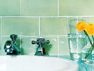
How 'bout mint green in very brick-like design, matched with contemporary hardware and fixtures?
 Does this picture make you dizzy? Me too!
If I were going for a Zen approach to a bath redo, I'd have a hard time resisting this glass tile that looks like seaglass - all dressed up!
 Though this bathroom may be small - with floor-to-ceiling, large, polished marble - it qualifies for nothing short of posh


1 comments:
Love the bathroom pics! I have a few ideas for the master bath now. I will definitely be showing Scott the seaglass tile, love it!!
Finally finished the boys bathroom. I'll have to send you pics.
Post a Comment